
Trading cryptocurrency without understanding the market can quickly result in big losses. Whether you want to hold onto your crypto long-term or trade it daily, it is vital to have a strategy. Comprehensive analysis and planning can go a long way to avoiding some risk that comes with trading. One of the best ways to embark on a trading journey is by learning how to identify crypto market trends. This guide will dive into what these trends are and how traders can spot them.
What is a crypto market trend?
A crypto market trend is a tendency for data – usually price points – to follow a certain direction on a price chart over time. It can be perceived as a signal of future price movements and forms the basis of many trading strategies.
There are two main types of trends that traders identify when analysing the market: uptrends and downtrends.
Uptrend (bullish)
An uptrend, also known as a bullish trend, occurs when a cryptocurrency’s price experiences a sustained rise. On a chart, this will appear as higher price highs over a period of time (Figure 1). Bullish trends occur when a crypto’s demand (buyers) outweighs the supply (sellers).
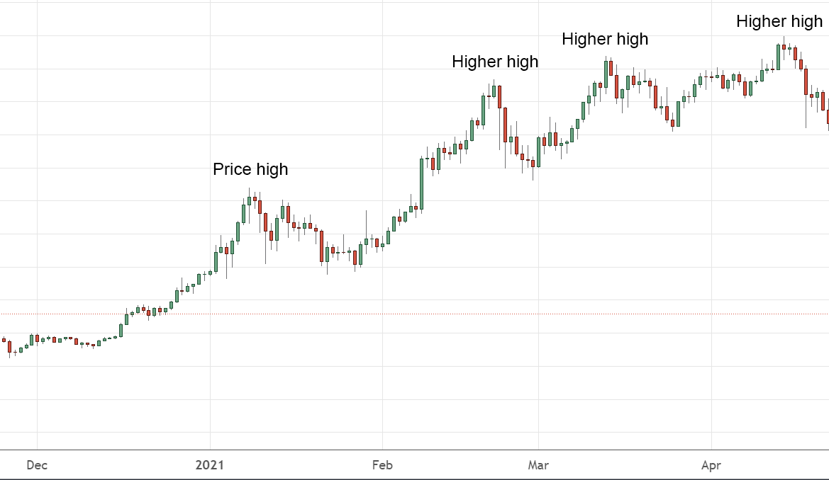
Figure 1 – A series of higher price highs indicating an uptrend
Downtrend (bearish)
A downtrend, also called a bearish trend, is a drop in the average price of a cryptocurrency over a certain timeframe. In a downtrend, the asset price action will continue to create lower lows on a chart (Figure 2). This occurs when a market’s sellers are stronger than its buyers.
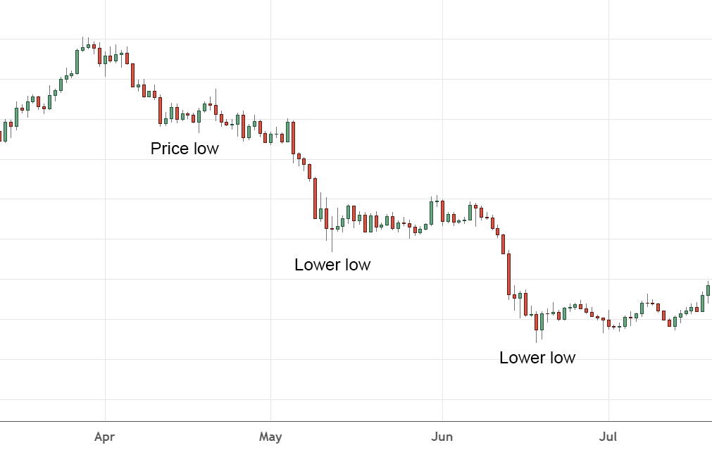
Figure 2 – A series of lower price lows signalling a downtrend
Things to consider
It’s easy enough to spot cryptocurrency market trends without context. However, this can easily lead to false trading signals and loss of money. It’s important to understand the nuances that come with determining price trends.
Timeframe
The very first step when identifying market trends is to choose a timeframe. Traders can configure the candlesticks on their charts to cover various timeframes, from one second up to one month. Adjusting the duration of a chart can make a significant impact on what a trend looks like.
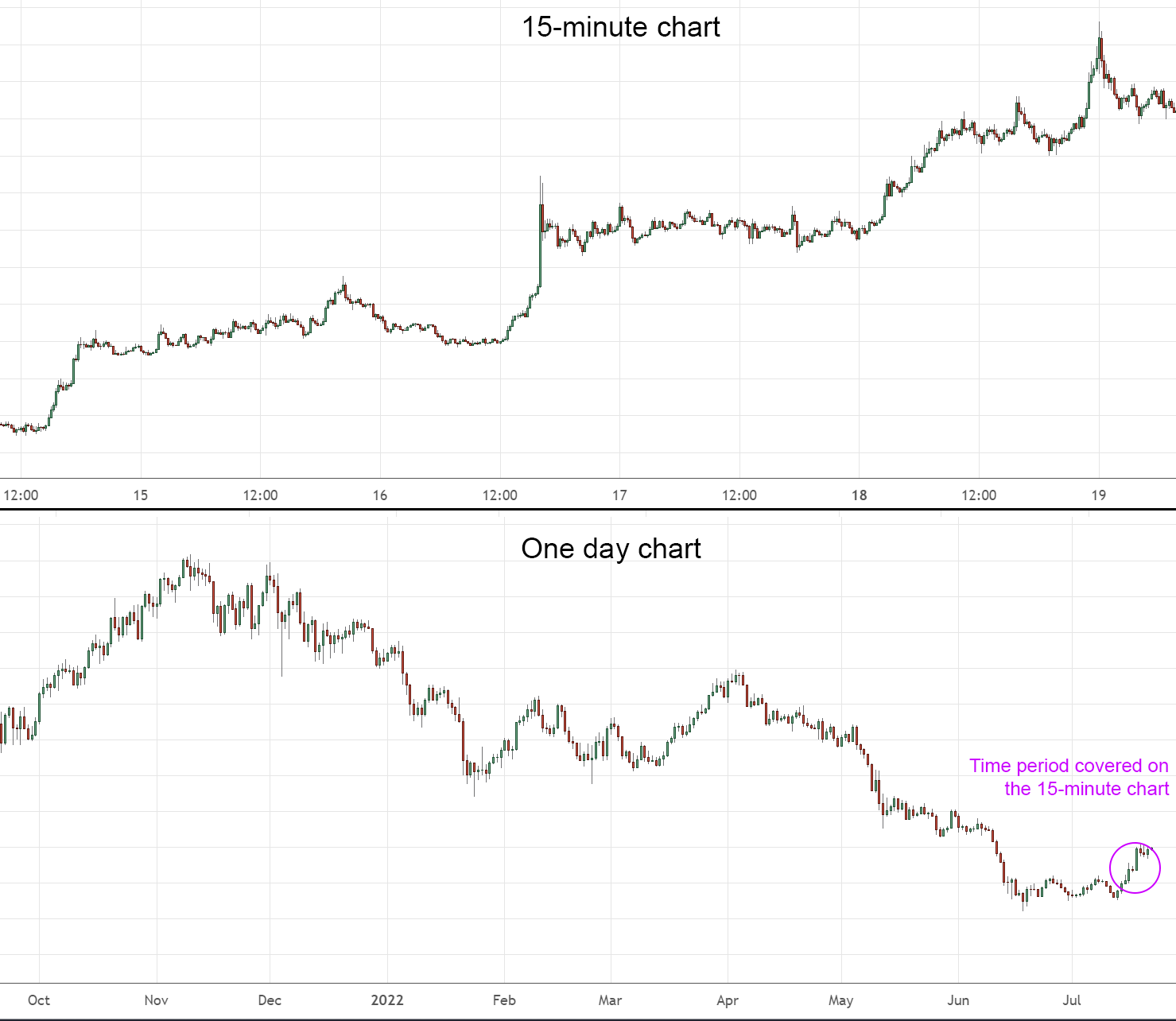
Figure 3 – Comparison of conflicting trends over different chart timeframes
For example, an Ethereum chart might show a bullish trend when viewed at a 15-minute interval. However, the same chart might show a bearish trend when viewed over a one-day period (Figure 3).
Tip
Day traders often use timeframes of an hour or less when attempting to identify and leverage short-term trends. Conversely, longer-term traders will want to consider using a period of a day or more to determine ongoing trends.
Market cycles
Learning how market cycles work is an important way of contextualising trends. Among traders and economists, there are two common ways of understanding cryptocurrency market cycles: technical and psychological. Psychological market cycles refer to how traders emotionally react to certain market events. On the other hand, a technical philosophy is a broader way of viewing a market cycle. For the purpose of this article, we will be using the technical version.
A technical market cycle consists of four main phases: accumulation, upward trend, distribution and downward trend. The ‘accumulation’ phase occurs when the market has experienced a sustained drop in value. Traders assume the bleeding will stop and begin to rebuild their portfolios at a lower price. The stable increase in buying power leads to an ‘upward trend’ in the market. As the market peaks, investors will start to take their profits and enter the ‘distribution’ phase. In the final stage, sellers completely take over the market, and crypto prices start toppling, forming a ‘downward trend’.
Though the technical market cycle is useful for analysing crypto trends, it is not a hard-and-fast rule. During any of these phases, a trend can be broken. Peaks and troughs outside of one of these trends may indicate a reversal.
How to identify crypto market trends
Identifying market trends by hand can be useful, but most traders will benefit from confirming momentum with technical analysis (TA) tools like trendlines, the Relative Strength Index (RSI), or Moving Averages (MA).
Trendlines
Drawing trendlines is one of the simplest and most popular methods for observing trends on a chart. It involves drawing a straight line that connects the significant peaks or troughs of a cryptocurrency’s price. Uptrend lines are drawn using price lows (below the price action), as shown in Figure 4 below.
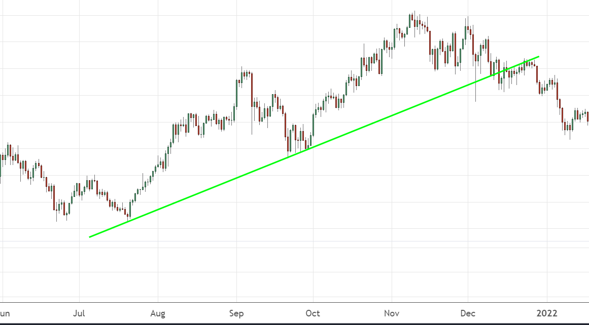
Figure 4 – An uptrend (bullish)
In contrast, a downtrend line is determined according to its price highs (above the price action), as illustrated in Figure 5.
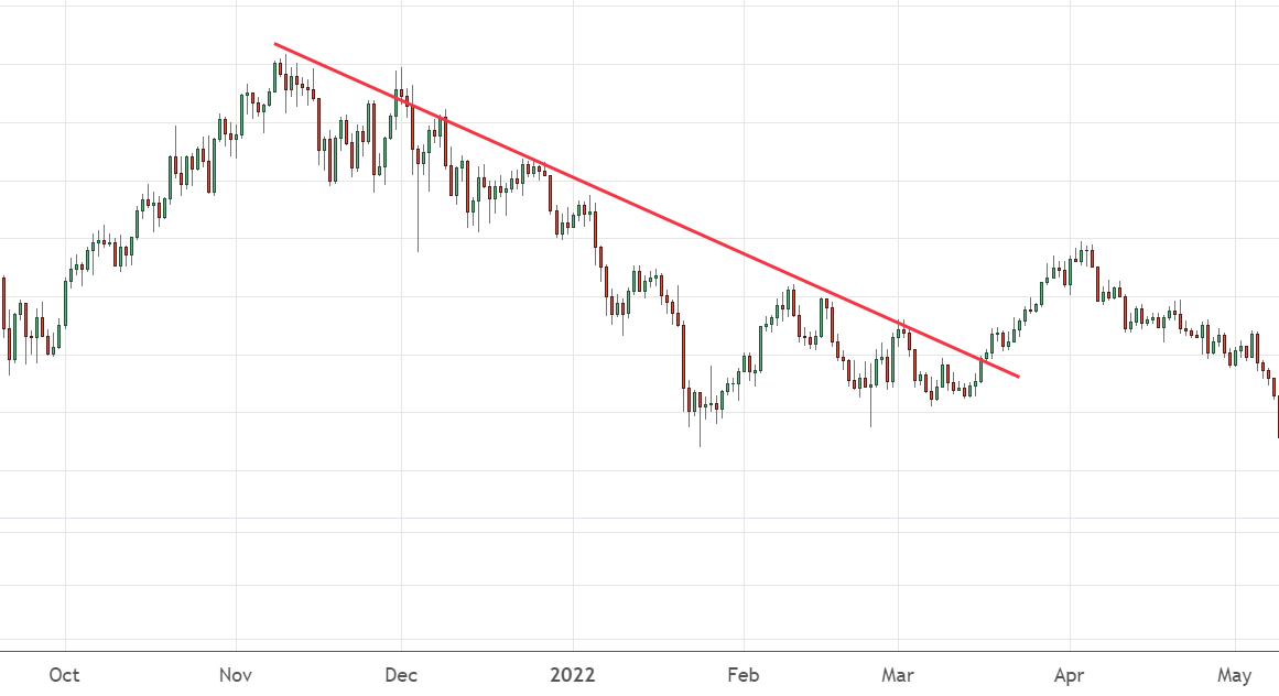
Figure 5 – A downtrend (bearish)
Trendlines can be used to help traders identify trend direction, as well as selling and buying opportunities. Additionally, price action that deviates from a trendline might indicate sentiment reversal and changing market conditions.
Tip
It can be a good idea to use a Moving Average (MA) or EMA to help draw trendlines more accurately when performing technical analysis. A Moving Average smooths out market price movement over a set period and can present a more intuitive visual guide to follow when drawing trendlines instead of following price action. However, even the most precise trendlines will struggle to fit price action within its bounds perfectly.
Support and resistance
Support and resistance levels are price points where market trends have historically shifted. Support levels occur during a downtrend where buyers begin to outweigh sellers and bearish momentum is halted (Figure 6).
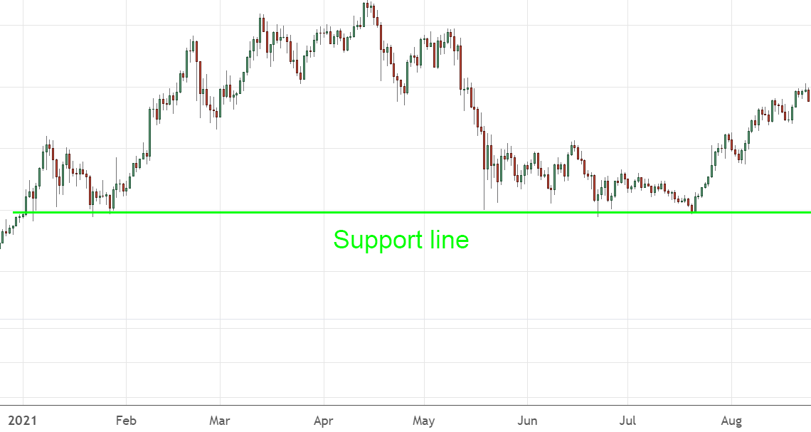
Figure 6 – A support line indicating buyers taking control
On the other hand, a resistance level is the point where an uptrend meets its peak and the crypto starts getting sold off (Figure 7).
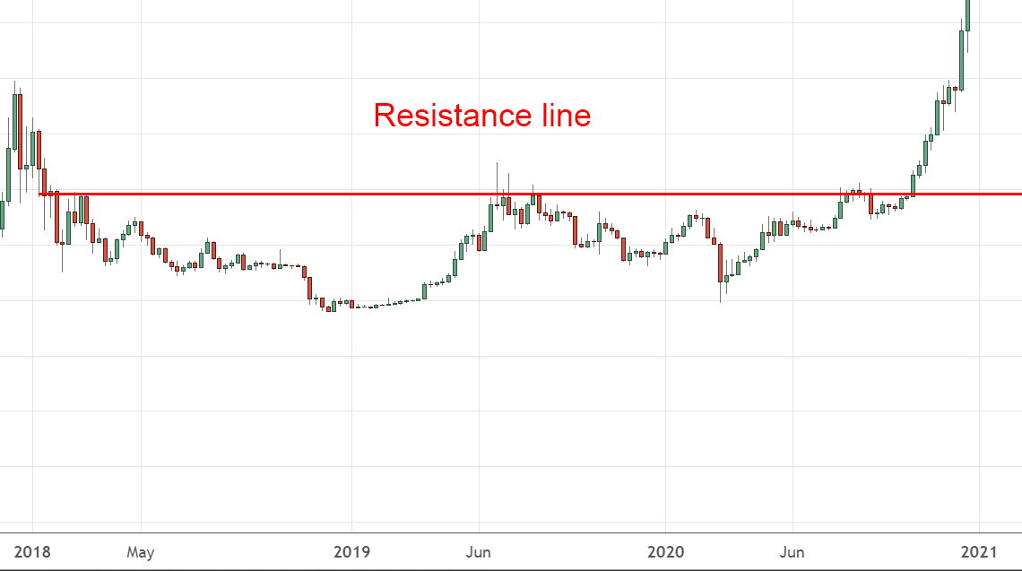
Figure 7 – Resistance level indicating sellers taking control
These levels are predetermined based on previous price action. Instances where an asset’s price breaks through the support or resistance levels may indicate the reversal or confirmation of a trend.
An easy way to conceptualise a support and resistance trading strategy is to think of a fly stuck inside a multi-storied house. There is the support (floor) and resistance (roof) that keeps the fly (the price of a cryptocurrency) confined. Occasionally, the fly will sneak through the roof and into the room on the level above. The original roof (resistance) now becomes the new floor (support), and so on.
Key Takeaway
When a price breaks the support or resistance levels, this is often interpreted as an indicator to take action. Price rising above the resistance level is typically considered a buy signal, whereas a drop below the support level can indicate an exit point.
Moving averages
A moving average (MA) is a visual representation of a cryptocurrency’s price over time. MAs smooth out historic price data to draw an easy-to-read dynamic line on a chart. They can give a clearer picture of current price trends by removing the noise from a graph’s frequent shifts in price.
A crossover is one of the most common trading signals observed when analysing moving averages. It occurs when two different MAs (usually set to 50-day and 200-day periods) cross over one other, which may indicate a shift in trend.
A bullish crossover (or a golden cross) results from a short-term MA line moving above the longer-term MA line (Figure 8). This can be interpreted as a positive or bullish trend signal.
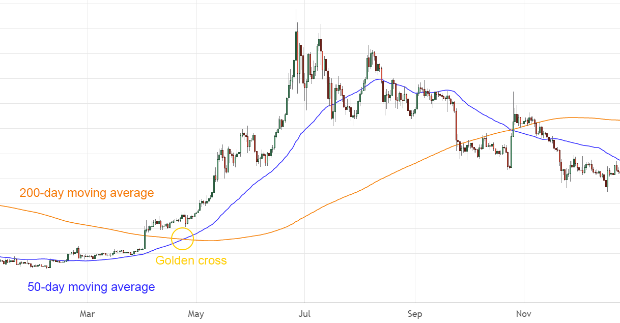
Figure 8 – A golden cross on the Bitcoin daily chart
The death cross (or a bearish crossover) occurs when the short-term MA line crosses below the long-term MA (Figure 9). This can indicate a bearish trend and a potential selling point for traders.
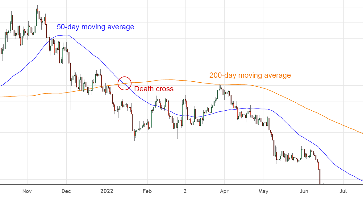
Figure 9 – A death cross on the Bitcoin daily chart
Relative Strength Index
The Relative Strength Index (RSI) is an oscillator that indicates whether an asset is overbought or oversold. Traders typically use the RSI to determine entry and exit points in a market. However, this analysis tool can also be useful for identifying shifts in momentum.
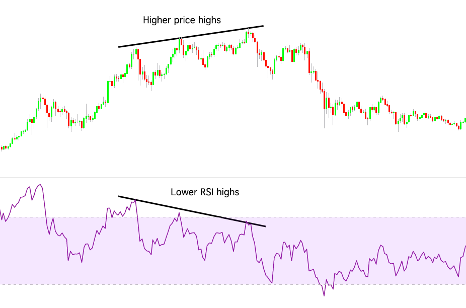
A common method of analysing trends with the RSI is through divergences. Divergences occur when the price action of a cryptocurrency moves in the opposite direction of an RSI graph. This can indicate that the current market trend is losing momentum and a reversal is on the cards.
There are two types of RSI divergences – bearish and bullish. Bearish divergences happen when the highs of an asset are trending upwards, but the highs of the RSI are lowering (Figure 10). This suggests an impending downtrend.
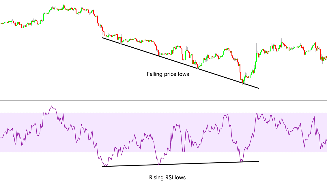
On the other hand, a bullish divergence occurs when a chart’s price action is reaching lower lows, but the RSI’s lows are rising (Figure 11). This may signal a trend reversal and an upcoming bullish trend.
Ichimoku Cloud
The Ichimoku Cloud is one of the more complex technical indicators out there (Figure 12). At first glance, it can look rather overwhelming. However, it is a powerful tool that traders can harness to identify the direction of a price trend in both the short and long term.
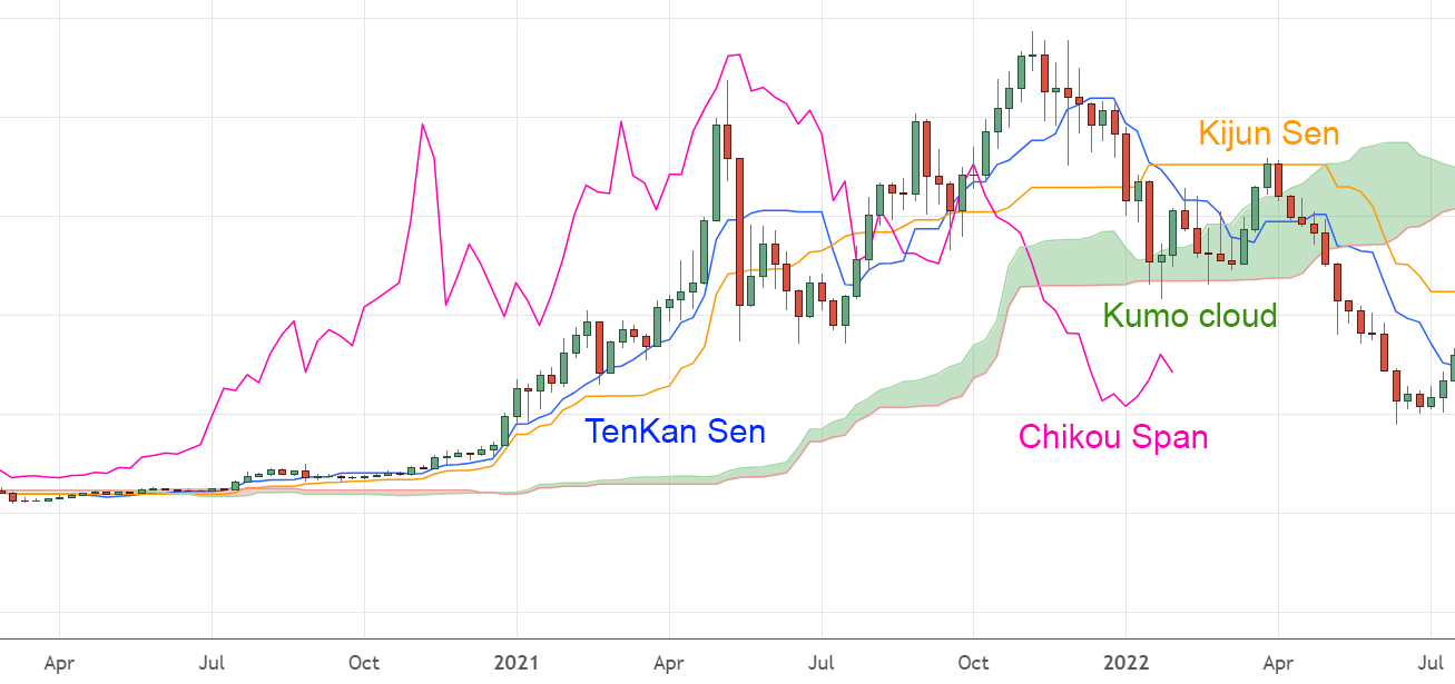
Figure 12 – The four elements of the Ichimoku Cloud
There are four key elements to understanding the cloud. The TenKan Sen is simply a moving average line based on the previous nine periods and used to identify short-term trends. The Kijun Sen is another MA, but this time looks at longer-term trends by incorporating price data from the last 26 periods. Traders can analyse these aspects of the Ichimoku Cloud similarly to MA crossovers.
The Kumo Cloud is the key to using Ichimoku’s Cloud when identifying market sentiment and momentum. As a general rule, if the price action of a cryptocurrency lies above the cloud, this indicates a bullish trend. If the price sits below the cloud, this usually indicates a downtrend. Trend reversals can be spotted when the price action breaks from one side of the cloud to the other, as can be observed in the example above.
Finally, the Chikou Span is a line that depicts the current price action, but is lagging behind on the chart – typically by 26 periods. The Chikou Span lags behind the rest of the Ichimoku Cloud, so it can be easily visualised when conducting analysis. In general, if the Chikou Span’s line is above both the price and the Kumo Cloud, this indicates strong bullish momentum. Conversely, if the Chikou Span crosses beneath the price or the Kumo Cloud, it may be interpreted as a downtrend signal.
Wrap up
Technical indicators can be an excellent way for traders to identify major market trends and formulate their trading strategies. Understanding how to identify momentum in a market can go a long way to improving your skills when trading cryptocurrency. However, it’s vital to remember that technical indicators aren’t always accurate. Each indicator has its own strengths and weaknesses. Using multiple trading tools in tandem can help plug the holes of using just one.
Disclaimer: The information on Swyftx Learn is for general educational purposes only and should not be taken as investment advice, personal recommendation, or an offer of, or solicitation to, buy or sell any assets. It has been prepared without regard to any particular investment objectives or financial situation and does not purport to cover any legal or regulatory requirements. Customers are encouraged to do their own independent research and seek professional advice. Swyftx makes no representation and assumes no liability as to the accuracy or completeness of the content. Any references to past performance are not, and should not be taken as a reliable indicator of future results. Make sure you understand the risks involved in trading before committing any capital. Never risk more than you are prepared to lose. Consider our Terms of Use and Risk Disclosure Statement for more details.