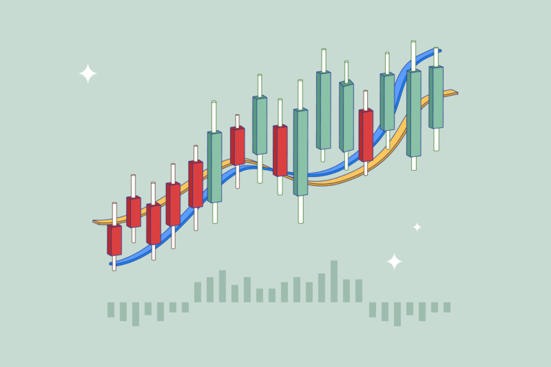
The Moving Average Convergence Divergence (MACD) provides traders with powerful insight into the momentum of a market. It’s one of the world’s most popular analysis strategies, used by both novices and seasoned veterans. This guide will walk you through what a MACD does, how traders can implement it, and some of its limitations.
What is the MACD?
The MACD is intended to be an easy-to-interpret analysis method that requires very little maintenance. It is a technical analysis (TA) tool used to follow the price trends of an asset and determine momentum strength. This type of TA indicator is known as an oscillator, which plots price movements between two bands, much like an RSI or Bollinger Bands. Oscillators can provide buy and sell signals so traders know whether a cryptocurrency like Bitcoin is oversold or overbought.
The MACD was developed by a giant of the trading industry, Gerald Appel, who passed away in 2020. Appel’s career as a financial advisor stretched five decades, where he penned more than 15 books. His answer was short and sweet when asked why he invented the MACD: “I guess I was just looking for new indicators!”.
Tip
The MACD relies on historical price data to provide trend signals to traders and is therefore known as a lagging indicator. These indicators are more useful for determining the strength of a trend, as opposed to its direction. On the other hand, tools like the RSI are called leading indicators as they attempt to predict future price trends.
How does the MACD work?
The MACD indicator (Figure 1) comprises two important lines (and a bar chart). Before exploring them, it’s important to understand how a moving average (MA) works.
Moving averages calculate an asset’s price action over a set period. It then charts this information as a single, dynamic line, making it easy for traders to visualise longer-term trends. The MACD utilises an exponential moving average (EMA), which weights recent price action as more important than older data.
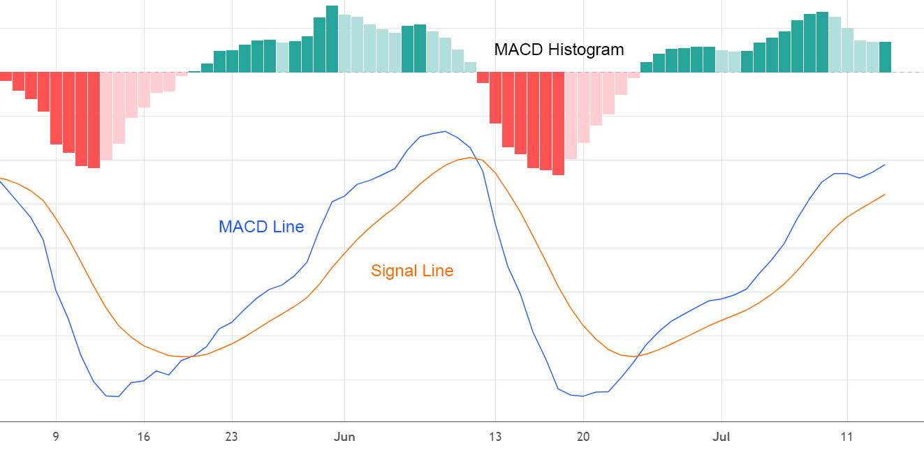
Figure 1 – Breakdown of MACD components
MACD line
The MACD line is primarily intended to follow the momentum of a market. It represents the distance between two EMAs. These EMAs are calculated based on an asset’s closing price. By default, the MACD line incorporates price data from the past 12 and 26 days. It will then form a single line based on these two averages. The specific timeframe used can be adjusted depending on what the trader wants.
Signal line
When analysed in conjunction with the MACD line, the signal line is primarily used to predict trend reversal in the market. Signal lines use an EMA of the MACD line’s movement from the previous 9 days. This differs from the MACD line, which averages out price action instead.
MACD histogram
The histogram integrates data from both the MACD and the signal line. It is a visual representation of how close together these two lines are. MACD histograms are portrayed as bar graphs to help declutter the chart.
Did You Know?
The data from each MACD line can be adjusted to suit a trader’s individual needs. The default settings (12, 26 and 9 days) are intended for shorter-term charts. Day traders or long-term investors may want to optimise these settings for their preferred trading style.
How to read the MACD?
There are a few ways traders can interpret data from the MACD. Crossovers are the most important indicators to look out for when using the MACD. These trading signals appear whenever the MACD line meets with either the signal line or centreline.
Centreline crossover
Centreline crossovers are a frequent trading signal seen in MACD analysis. These crossovers occur when either the 12-day or 26-day EMA becomes more valuable than the other. For example, a negative centreline crossover (Figure 2) would indicate the 26-day EMA is now higher than the 12-day EMA. Visually, this would be represented by the MACD line moving below the centreline of the MACD histogram. Negative centreline crossovers signal the downward momentum of an asset’s price.
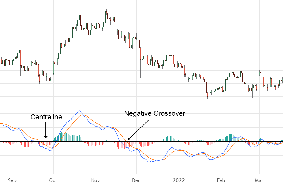
Figure 2 – A negative centreline crossover, indicating a sustained downward trend
On the other hand, a positive centreline crossover (Figure 3) occurs when the 12-day EMA surpasses the 26-day EMA. This is depicted by the MACD line moving above the histogram centreline. This signal tends to suggest a sustained uptrend in price.
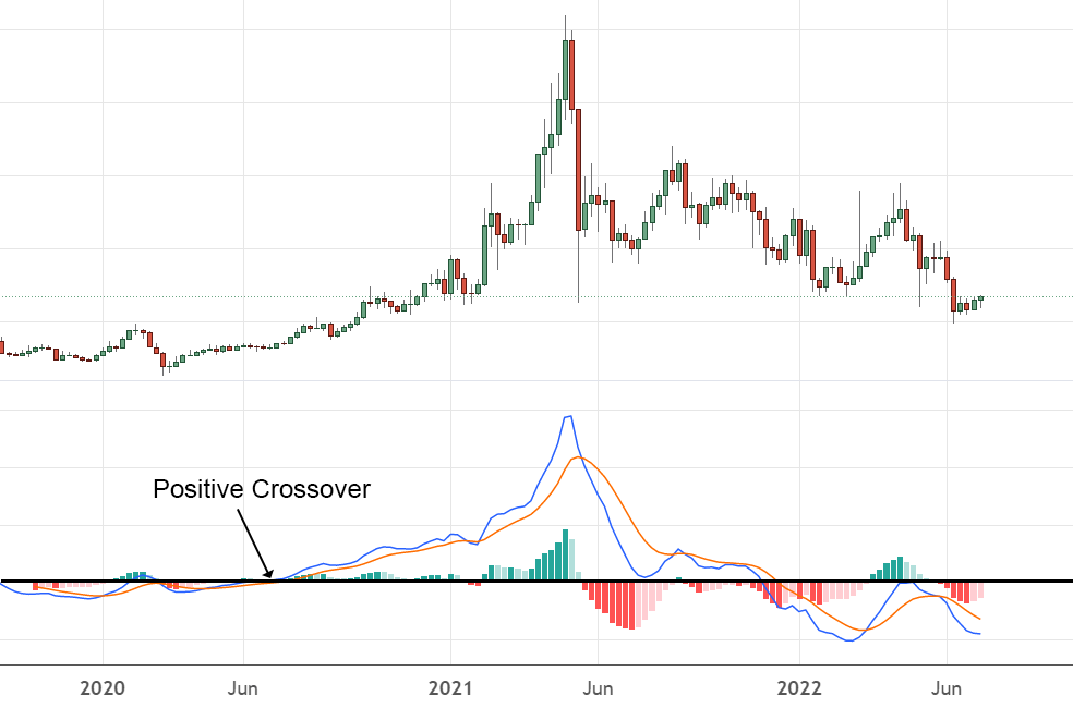
Figure 3 – A positive centreline crossover signalling a sustained uptrend
Signal line crossover
Signal line crossovers are the most common indicator seen when interpreting MACD charts. They occur when the MACD line (blue) moves above or below the signal line (orange). A positive signal line crossover (the MACD line crosses above the signal line) might indicate a good opportunity for market entry. Conversely, a negative signal line crossover might indicate a selling point.
Crossover trading signals are much more reliable when read in the context of a pre-existing trend, known as bullish or bearish confirmation. It’s also important to note that positive crossovers that occur below the centreline are not as useful.
Key Takeaway
Crossovers can be a useful way of determining momentum shifts in an asset’s price. This indicator is particularly helpful for assessing the strength of a trend in an established bull or bear market.
MACD and price divergences
Another way traders can interpret MACD charts is through price convergences and divergences. This indication occurs whenever the MACD chart moves in a way that contradicts price action. Price divergences are a method of observing trend momentum.
For example, let’s use bullish divergences (Figure 4). This occurs when the chart of an asset shows two consecutive lows in price. If the MACD line is higher on the second price action than the first, this suggests that the long-term trend of the asset remains bullish, despite a short-term drop in value.
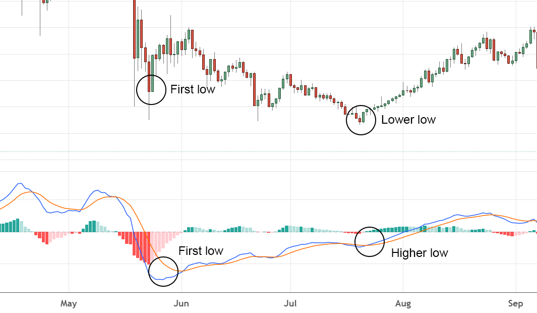
Figure 4 – A bullish divergence
On the other hand, two rising highs on a chart may indicate a shift in trend. If the MACD’s line on the second high is lower than the first, this is a bearish divergence (Figure 5). Therefore, the price movement of this asset may continue to fall in the long term, even though the market value has been increasing.
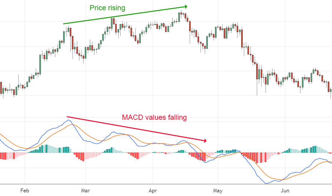
Figure 5 – A bearish divergence
MACD vs RSI
The MACD and the relative strength indicator (RSI) are both oscillators used to identify momentum shifts in the market. An RSI uses recent price action compared to highs and lows to determine if an asset is overbought or oversold. Conversely, MACD uses two variable EMAs to signal market trends.
MACD and RSI indicators are frequently used together by traders to get a broader, more reliable picture of an asset’s momentum. Because each TA tool uses a different equation, they occasionally contradict one another’s signals. For example, an RSI indicating an oversold market (an RSI of under 30) might coincide with a negative centreline crossover on the MACD chart.
However, they can be applied in tandem to help confirm a buy/sell signal or trend reversal in the market.
Tip
If the RSI reads over 70, this suggests an asset has been overbought and a potential price correction. Conversely, a reading under 30 signals overselling and a possible reversal in momentum. A common strategy for reading an RSI is through price divergences, which can be used to complement divergence interpretations on a MACD chart.
Limitations of the MACD
The limitations of using the MACD tool are largely subjective. The potential disadvantages encountered will depend on which analysis strategy a trader implements.
For example, a limitation of the MACD price divergence method is its tendency to produce false signals when used in isolation. Signals are exactly that – a cue, not a hard and fast rule. Further technical analysis should be used to confirm any trend reversals interpreted from a MACD chart.
Additionally, the data used for reading crossovers can often lag behind real price action. While this can be a good way of reading long-term trends, signals may often come too late for day traders to benefit from their analysis.
The MACD is especially useful in an already-trending market. It can be a powerful way of determining momentum strength and potential reversals. However, the MACD’s utility is somewhat blunted in a sideways-moving market. In such conditions, it can be hard to observe a breakout or the emergence of a new trend.
Wrap up
The Moving Average Convergence Divergence is an important trading analysis tool to get the hang of. It is straightforward to interpret and integrates seamlessly with other well-known indicators like the RSI. Its utility and simplicity have made the MACD popular among traders for almost fifty years.
With practice, the MACD can be a helpful way for investors to spot shifts in momentum strength. Traders can also use the MACD to identify solid exit and entry points if combined with multiple indicators.
Disclaimer: The information on Swyftx Learn is for general educational purposes only and should not be taken as investment advice, personal recommendation, or an offer of, or solicitation to, buy or sell any assets. It has been prepared without regard to any particular investment objectives or financial situation and does not purport to cover any legal or regulatory requirements. Customers are encouraged to do their own independent research and seek professional advice. Swyftx makes no representation and assumes no liability as to the accuracy or completeness of the content. Any references to past performance are not, and should not be taken as a reliable indicator of future results. Make sure you understand the risks involved in trading before committing any capital. Never risk more than you are prepared to lose. Consider our Terms of Use and Risk Disclosure Statement for more details.